

Gold Peak Tea | Product Redesign
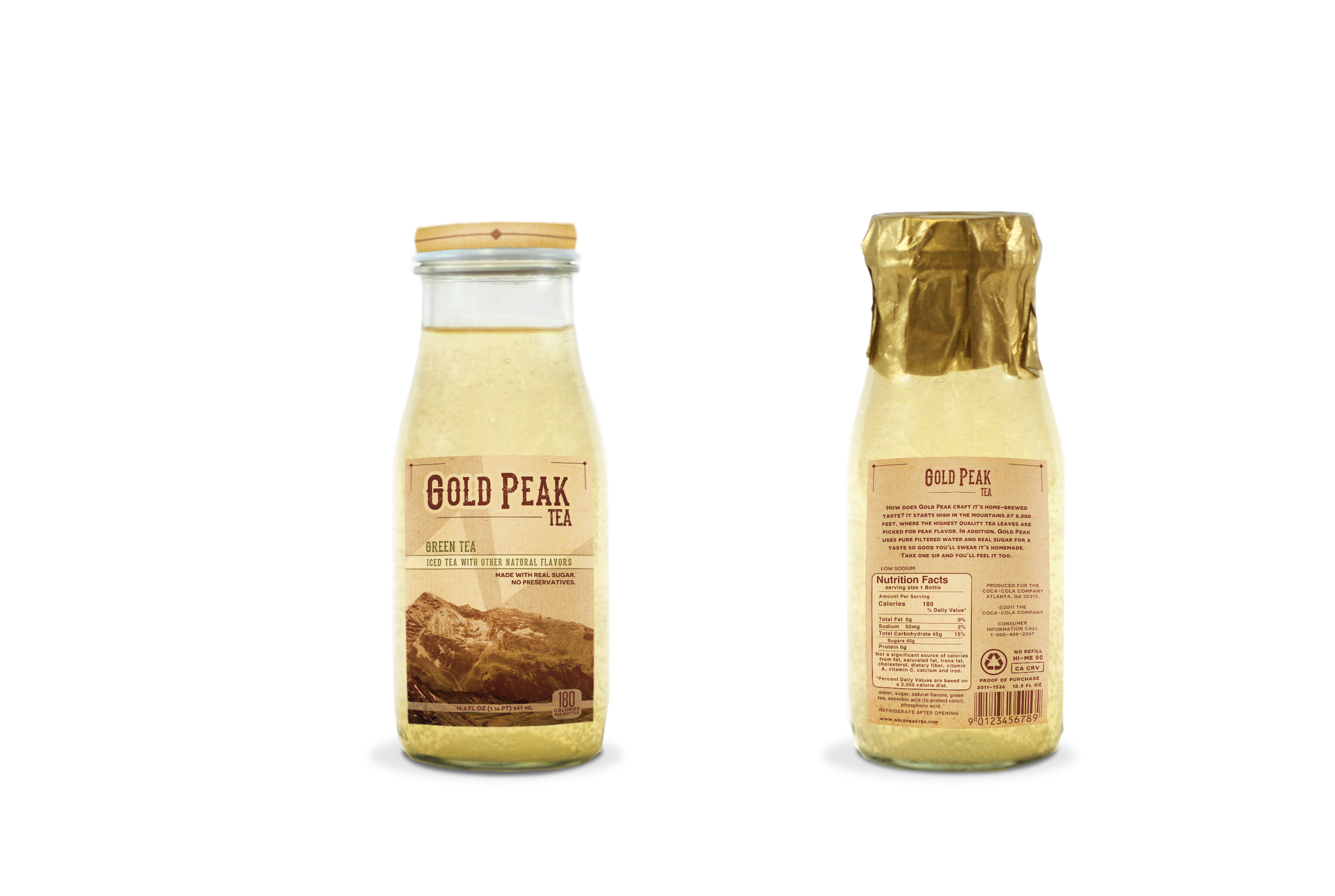
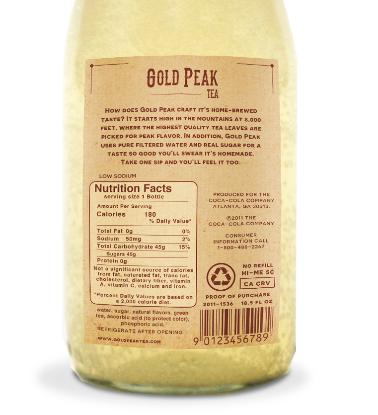
Some products could use an update to their current design, and Gold Peak Tea was labeled in such a way that seemed to have many unnecessary elements, and didn’t really speak to the inspiration behind the company, or the idea that the name seems to be trying to communicate: classic tea from the mountains of the midwest.
I went with a more rustic look, changed the bottle to glass instead of plastic, and used warm, inviting colors in the label to really draw in an audience who like things done “the old fashioned way.”

